Rich time series like sound recordings can be converted to spectrograms, e.g., ussing FFT methods.
Spectrograms show the distribution in the frequency domain as a function of time.
In practice this is implemented by a moving window technique with local FFT computations (overlapping windows) called Short-time Fourier transform.
Some limitations:
The decomposition is dependent on the sampling frequency, (samples per second), and time window length seconds.
The highest frequency that can be resolved is called the Nyquist frequency Hz, i.e., 22050 Hz for a 44.1 kHz sampling (due to the Fourier transform).
The lowest frequency that can be resolved is the Rayleigh frequency Hz, i.e., for a window of length 1152 samples (MP3) and 44.1 kHz, this results in a minimum frequency of .
Too short windows will give a “smearing effect” on the extracted frequencies (see Wikipedia article) where precision is low on the extracted frequencies.
For time series, this means we have an upper bound (often of less interest) and a lower bound of the frequencies that can be resolved. The lower bound being “waves in the signal” “length of the window”.
# Create a sine wave that starts low and increases during 4 seconds with a sampling rate of 44.1 kHz.
import numpy as np
fs = 44100 # Sampling rate
sec = 4   # Duration of the tone in seconds
t = np.linspace(0, 4, sec*fs)      # Time axis
f = np.linspace(200, 5000, sec*fs) # Frequency axis
y_approx = np.sin(2*np.pi*np.cumsum(f)/fs) # Approximation of the sine wave

# Plot the sine wave at the beginning, middle and end
import matplotlib.pyplot as plt
plt.figure(figsize=(12,3))
plt.plot(range(600), np.hstack([y_approx[:200],y_approx[int(sec/2*fs):int(sec/2*fs)+200], y_approx[-200:]]))
plt.xlabel('Selected time (samples)')
plt.ylabel('Amplitude')
plt.show()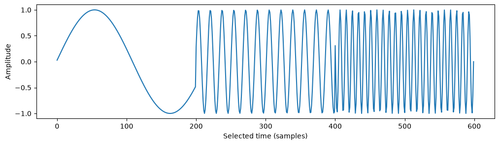
# Play the song using sounddevice
import sounddevice as sd
sd.play(y_approx, fs)
Spectrogram computation
SciPy’s Short Time Fourier Transform returns all the ingredients needed to plot a spectrogram manually.
matplotlib’s specgram combines computations and plotting
# Produce a spectrogram using scipy.signal.stft (short-time Fourier transform)
from scipy.signal import stft # Legacy function stft. Anyone want to update this to ShortTimeFFT?
f_stft, t_stft, Zxx = stft(y_approx, fs, nperseg=1152)
# Plot the spectrogram
import matplotlib.pyplot as plt
plt.pcolormesh(t_stft, f_stft, np.abs(Zxx), vmin=0, vmax=max(y_approx), shading='gouraud')
plt.title('STFT Magnitude')
plt.ylabel('Frequency [Hz]')
plt.xlabel('Time [sec]')
plt.show()
# Plot the spectrogram without pre-computed frequency and time axes
import matplotlib.pyplot as plt
plt.specgram(y_approx, Fs=fs, NFFT=1152, noverlap=400, scale='linear')
plt.xlabel('Time (s)')
plt.ylabel('Frequency (Hz)')
plt.colorbar()
plt.show()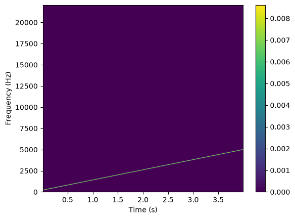
# Music: https://www.chosic.com/free-music/all/
# Load MP3 file Bird.mp3 and plot the spectrogram
# NOTE: Needs `ffprobe` or `avprobe` installed on the computer.
# Add /opt/homebrew/bin to PATH on macOS with Homebrew
import os
os.environ["PATH"] += os.pathsep + '/opt/homebrew/bin'
from pydub import AudioSegment
song = AudioSegment.from_mp3("../../data/Bird.mp3")

# Convert song to numpy array
samples = np.array(song.get_array_of_samples())
/Users/kristian/Documents/GitHub/IND320/.venv/lib/python3.12/site-packages/pydub/utils.py:300: SyntaxWarning: invalid escape sequence '\('
m = re.match('([su]([0-9]{1,2})p?) \(([0-9]{1,2}) bit\)$', token)
/Users/kristian/Documents/GitHub/IND320/.venv/lib/python3.12/site-packages/pydub/utils.py:301: SyntaxWarning: invalid escape sequence '\('
m2 = re.match('([su]([0-9]{1,2})p?)( \(default\))?$', token)
/Users/kristian/Documents/GitHub/IND320/.venv/lib/python3.12/site-packages/pydub/utils.py:310: SyntaxWarning: invalid escape sequence '\('
elif re.match('(flt)p?( \(default\))?$', token):
/Users/kristian/Documents/GitHub/IND320/.venv/lib/python3.12/site-packages/pydub/utils.py:314: SyntaxWarning: invalid escape sequence '\('
elif re.match('(dbl)p?( \(default\))?$', token):
# Play the song using pydub
sd.play(samples, 44100)
# Produce a spectrogram using scipy.signal.stft (short-time Fourier transform)
f, t, Zxx = stft(samples, song.frame_rate, nperseg=1152)# Plot the spectrogram
plt.pcolormesh(t, f, np.abs(Zxx), vmin=0, vmax=max(samples)/100, shading='gouraud')
plt.title('STFT Magnitude')
plt.ylabel('Frequency [Hz]')
plt.xlabel('Time [sec]')
plt.show()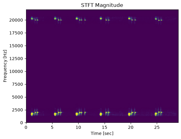
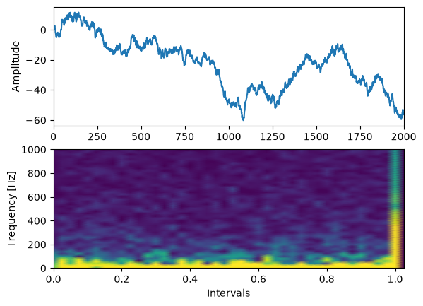
Spectrogram on time series
Here, we show a random series of data and its spectrogram.
An abrupt change in the frequency domain will show up in the spectrogram, maybe indicating a change in the underlying process.
# Our friend, the random series, but now a little longer
rng = np.random.default_rng(0)
n = 2001
y = rng.standard_normal(n).cumsum()
# Compute the spectrogram
f, t, Zxx = stft(y, 2000, nperseg=100)
# Plot the series y and the spectrogram above each other
import matplotlib.pyplot as plt
fig, axs = plt.subplots(2, 1)
axs[0].plot(y)
axs[0].set_xlim(0, n-1)
axs[0].set_ylabel('Amplitude')
axs[1].pcolormesh(t, f, np.abs(Zxx), vmin=0, shading='gouraud', vmax=1) # Play with the vmax parameter to enhance the contrast
axs[1].set_ylabel('Frequency [Hz]')
axs[1].set_xlabel('Intervals')
plt.show()