In contrast to statistical outliers, anomaly detection is more often concerned with local deviations than deviations from a common distribution.
We will cover two density based methods and one tree based method.
Density based methods are highly dependent on scaling.
The amount and type of scaling is problem dependent and can be considered part of the tuning.
DBSCAN
Density-Based Spatial Clustering of Applications with Noise.
No assumptions about distributions.
Definitions:
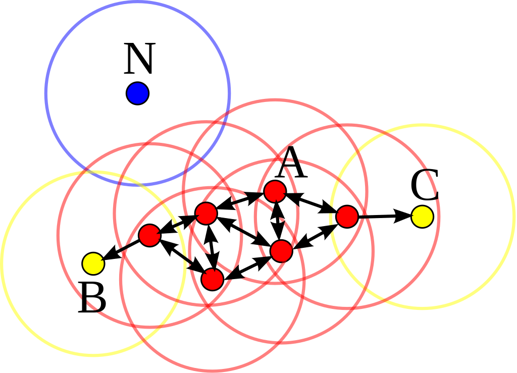
‘Core point’ if >= MinPts within radius .
‘Border point’ if < MinPts within radius , but within radius of a ‘core point’.
Else a ‘Noise points’.
Clustering:
Cluster ‘core points’ that lay within each others radii.
Assign ‘border points’ to their respective ‘core point’ clusters.
Our main interest is in detecting ‘noise points’, i.e., outliers.
Also, small clusters may be indicative of series of outliers.
DBSCAN in 2D
Illustration of the concept in 2D from Wikimedia CC-SA 3.0 by Chire
DBSCAN in 1D
To avoid a pure vertical clustering in the charts, we need to use the observation/time dimension actively.
The horizontal spacing between points in the chart will be an extra parameter to tune.
More than one variable can be included in DBSCAN, but these must be matched by some form of scaling, e.g., standardisation.
DBSCAN does not care about drift in mean values, only local density (pro and con).
# Random normal data
import numpy as np
import matplotlib.pyplot as plt
np.random.seed(1)
N = 1000
data = np.random.normal(0, 1, N)
plt.figure(figsize=(10,3))
plt.plot(data, 'o')
plt.ylim(-4.5, 4.5)
plt.xlim(0, N)
plt.axhline(0, color='black', linestyle='--')
plt.ylabel('Values')
plt.xlabel('Observations')
plt.show()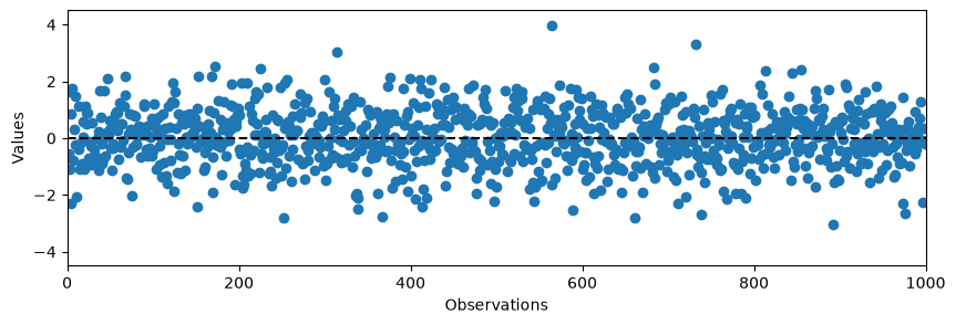
# Import DBSCAN from sklearn
from sklearn.cluster import DBSCAN

# Reshape the data to a column vector together with an index column
step_size = 0.02
data2D = np.array([data, np.linspace(0, N*step_size, N)]).T

# Initialize and fit the DBscan model
db = DBSCAN(eps=0.5, min_samples=3, metric='euclidean')
db.fit(data2D)

# Obtain the predicted labels and calculate number of clusters
pred_labels = db.labels_
# -1 is an outlier, >=0 is a cluster

# Count number of samples in each cluster
counts = np.bincount(pred_labels+1)
counts
array([ 28, 957, 4, 3, 5, 3])# Show the cluster labels
from matplotlib.lines import Line2D
plt.figure(figsize=(10,3))
plt.plot(data2D[:,1], data2D[:,0], 'o')
plt.ylim(-4.5, 4.5)
plt.xlim(0, max(data2D[:,1]))
plt.axhline(0, color='black', linestyle='--')
plt.ylabel('Values')
plt.xlabel('Scaled observations')
# Plot special samples in red and orange
for i in range(len(data)):
if pred_labels[i] == -1:
plt.plot(data2D[i,1], data2D[i,0], 'o', color='red')
if pred_labels[i] > 0:
plt.plot(data2D[i,1], data2D[i,0], 'o', color='orange')
legend_elements = [Line2D([0], [0], marker='o', color='red', label='outlier', linestyle='None'),
Line2D([0], [0], marker='o', color='orange', label='cluster', linestyle='None')]
plt.legend(handles=legend_elements, bbox_to_anchor=(1.05, 1), loc=2)
plt.grid()
plt.show()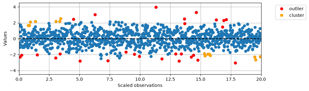
# Convert the above plot to Plotly format
import plotly.graph_objects as go
fig = go.Figure()
fig.add_trace(go.Scatter(x=data2D[:,1], y=data2D[:,0], mode='markers', marker=dict(color='blue'), name='normal'))
fig.add_trace(go.Scatter(x=data2D[:,1][pred_labels==-1], y=data2D[pred_labels==-1,0], mode='markers', marker=dict(color='red'), name='outlier'))
fig.add_trace(go.Scatter(x=data2D[:,1][pred_labels>0], y=data2D[pred_labels>0,0], mode='markers', marker=dict(color='orange'), name='cluster'))
fig.update_layout(title='DBSCAN Anomaly Detection', xaxis_title='Scaled observations', yaxis_title='Values')
fig.show(renderer="notebook")Exercise
Look at the DEWP measurements in the Beijing pollution data (2000 timepoints).
Try to tune a DBSCAN on the data.
Does it work as advertised?
Local Outlier Factor - LOF
LOF is a method that tries to determine if an observation is an outlier based on the density of observations around itself compared to the density of observations around its k nearest neighbours.
The general assumption is that is an outlier, but this is problem dependent.
Definitions for LOF
For an observation A and a neighbour B:
k-distance(A) = distance(A, k-th nearest neighbour)
k-neighbourhood:
,
i.e., all observations no farther away than the k-th nearest point.Reachability distance:
,
i.e., the maximum of observation B’s k-distance and the actual distance between A and B.
This is maybe the least intuitive definition here as it is called a distance but is based on density and thus is unsymmetric if you change around A and B. In the figure below, even though A is closer to B than to C.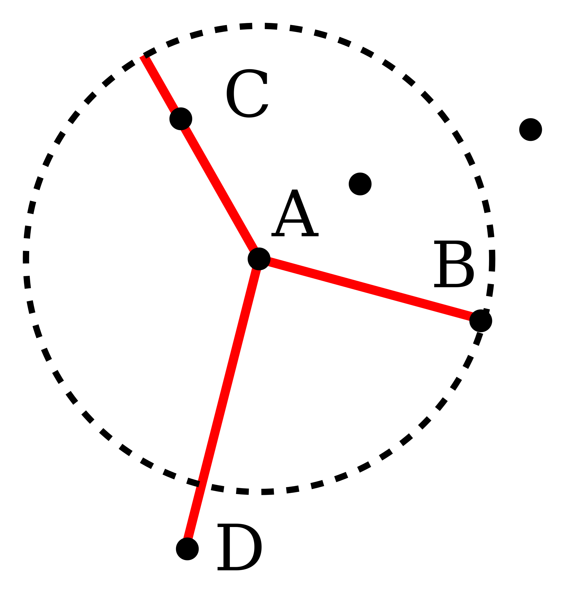
Local reachability density:
,
i.e., the inverse of the average reachability distance of A from its neighbours.Local Outlier Factor:
,
i.e., the average local reachability density of the neighbors divided by the object’s own local reachability density.
LOF in scikit-learn
As nearest neighbour searches can be time and memory intensive, the implementation lets the user choose between NN algorithms.
The type of distance can be chosen.
A “contamination” parameter is used to score samples by scikit-learn. This is the proportion of outliers, which can be set to “auto” for automatic estimation. Otherwise the proportion is used to find the threshold of outlyingness.
# Import LOF from sklearn
from sklearn.neighbors import LocalOutlierFactor

# Use the same data as above but replace DBSCAN with LOF
lof = LocalOutlierFactor(n_neighbors=20, contamination='auto') # 0.01)
pred_labels = lof.fit_predict(data2D)
counts = np.bincount(pred_labels+1)
print(counts)
print(counts[0]/sum(counts))
[ 19 0 981]
0.019
# Plot the LOF values
lof_pos = -lof.negative_outlier_factor_
plt.figure(figsize=(7,3))
plt.hist(lof_pos, bins=50)
plt.xlabel('LOF values')
plt.ylabel('Number of samples')
plt.show()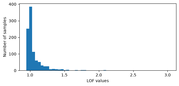
# Using default cutoff value of LOF = 1
lof_labels = 1-(lof_pos > 1)*2
np.bincount(lof_labels+1)
array([599, 0, 401])# Extract the estimated cuff-off value used to determine outliers
lof_scores = -lof.negative_outlier_factor_
cut_off = np.sort(lof_scores)[-counts[0]]
print(cut_off)1.5302463890590219
# Plot the results in the same way as above
preds = pred_labels.copy()
#preds = lof_labels
plt.figure(figsize=(10,3))
plt.plot(data2D[:,1], data2D[:,0], 'o')
plt.ylim(-4.5, 4.5)
plt.xlim(0, max(data2D[:,1]))
plt.axhline(0, color='black', linestyle='--')
plt.ylabel('Values')
plt.xlabel('Scaled observations')
for i in range(len(data)):
    if preds[i] == -1:
        plt.plot(data2D[i,1], data2D[i,0], 'o', color='red')
legend_elements = [Line2D([0], [0], marker='o', color='red', label='outlier', linestyle='None')]
plt.legend(handles=legend_elements, bbox_to_anchor=(1.05, 1), loc=2)
plt.grid()
plt.show()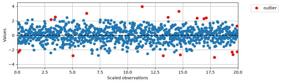
Isolation Forest
Isolation Forests use binary trees with random splits along variables/features to isolate outlying samles.
Basically, outlying observations are easier to split from inlying observation, thus having a shorter path through the tree before becomming a leaf node.
In contrast to DBSCAN and LOF, no density estimation is performed.
Isolation Forest algorithm
An Isolation Tree (iTree) is built on a subset of the samples as follows:
Randomly choose a feature.
Randomly split the (remaining) data along the feature.
If no more splits are possible (all observations are leafs (alone) or all samples are equal in the end nodes): terminate,
otherwise, repeat from 1.
The forest is created by building many iTrees (100 is default in scikit-learn).
Samples are deemed outliers if they on average become leaf nodes after few splits (low path-lengths in the trees).
In scikit-learn the cut-off for being an outlier is estimated automatically, but can be changed using the “contamination” parameter.
# Import IsolationForest from sklearn
from sklearn.ensemble import IsolationForest

# Use the same data as above but replace DBSCAN with IsolationForest
iso = IsolationForest(n_estimators=100, contamination=0.05)#'auto')
pred_labels_if = iso.fit_predict(data2D)
counts = np.bincount(pred_labels_if+1)
print(counts)
print(counts[0]/sum(counts))
[ 50 0 950]
0.05
# Plot the IF values
if_vals = iso.decision_function(data2D)
plt.figure(figsize=(7,3))
plt.hist(if_vals, bins=50)
plt.xlabel('IF values')
plt.ylabel('Number of samples')
plt.show()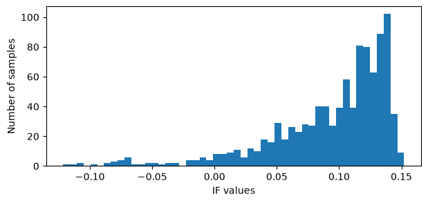
if_labels = 1-(if_vals < 0.01)*2
np.bincount(if_labels+1)
array([ 66, 0, 934])# Plot the results in the same way as above
preds_if = pred_labels_if.copy()
#preds_if = if_labels
plt.figure(figsize=(10,3))
plt.plot(data2D[:,1], data2D[:,0], 'o')
plt.ylim(-4.5, 4.5)
plt.xlim(0, max(data2D[:,1]))
plt.axhline(0, color='black', linestyle='--')
plt.ylabel('Values')
plt.xlabel('Scaled observations')
for i in range(len(data)):
if preds_if[i] == -1:
plt.plot(data2D[i,1], data2D[i,0], 'o', color='red')
legend_elements = [Line2D([0], [0], marker='o', color='red', label='outlier', linestyle='None')]
plt.legend(handles=legend_elements, bbox_to_anchor=(1.05, 1), loc=2)
plt.grid()
plt.show()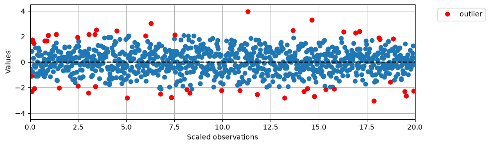
Exercise
Compare the three mentioned anomaly detection methods (DBSCAN, LOF and Isolation Forest) with regard to the samples seen as outliers.
Fix the parameters at min_samples = 3, n_neighbors = 20 and n_estimators = 100 and use eps and contamination to force 1, 2, ..., 10 outliers detected (if possible).
Are the three sets of 10 samples equal.
Do the samples appear in the same order for the different techniques?
Spearman correlation is one way of putting this into numbers.
Notebook Cell
# Dummy cell to ensure Plotly graphics are shown
import plotly.graph_objects as go
f = go.FigureWidget([go.Scatter(x=[1,1], y=[1,1], mode='markers')])