Various map types and overlays are available.
Open Street Map is open for use without a token.
Overlays include scatter, lines, densities, etc.
Choropleths (coloured map sections) can be used as overlays or as separate plots when a GeoJSON formated dictionary of map polygons are available.
# The following renders plotly graphs in Jupyter Notebook, Jupyter Lab and VS Code formats
import plotly.io as pio
pio.renderers.default = "notebook+plotly_mimetype"Map
Various maps with user defined overlays are available, e.g., scatter_map.
From Plotly version 5.24, Mapbox-es are deprecated, e.g., scatter_mapbox.
Writer has, as of 16. November 2024, not made the switch yet.
In most cases, switching between map and mapbox does not require other code changes.
import plotly.express as px
import pandas as pd

us_cities = pd.read_csv(
    "https://raw.githubusercontent.com/plotly/datasets/master/us-cities-top-1k.csv"
)

fig = px.scatter_map(
    us_cities,
    lat="lat",
    lon="lon",
    hover_name="City",
    hover_data=["State", "Population"],
    color_discrete_sequence=["fuchsia"],
    zoom=3,
    height=300,
    width=600,
)
fig.update_layout(mapbox_style="open-street-map")
fig.update_layout(margin={"r": 0, "t": 0, "l": 0, "b": 0})
fig.update_layout(mapbox_bounds={"west": -180, "east": -50, "south": 20, "north": 70})
figA local example from Ås
import pandas as pd

# Local restaurants and cafes
restaurants = pd.read_csv('../../data/restaurants.csv')
restaurantsfig_restaurants = px.scatter_map(
restaurants,
lat="lat",
lon="lon",
hover_name="name",
hover_data=["type","lat","lon"],
color_discrete_sequence=["green"],
zoom=14,
height=600,
width=700,
)
fig_restaurants.update_layout(mapbox_style="open-street-map")
fig_restaurants.update_layout(margin={"r": 0, "t": 0, "l": 0, "b": 0})
#fig_restaurants.update_traces(cluster=dict(enabled=True)) # Group restaurants when zooming out
fig_restaurantsprint(fig_restaurants)Figure({
'data': [{'customdata': array([['Restaurant', 59.6647728, 10.7896737],
['Restaurant', 59.6646628, 10.7887347],
['Restaurant', 59.6654962, 10.7953659],
['Restaurant', 59.6642813, 10.7922755],
['Restaurant', 59.6636019, 10.7929767],
['Kiosk', 59.6637434, 10.7932373],
['Restaurant', 59.663465, 10.7935577],
['Café', 59.6646862, 10.7908304],
['Café', 59.663324, 10.7943351]], dtype=object),
'hovertemplate': ('<b>%{hovertext}</b><br><br>lat' ... '{customdata[0]}<extra></extra>'),
'hovertext': array(['Sushiko Ås', "Charlie's Diner", "Jojo's Pizza", 'Desi Zaiqa',
'Babylon Pizza', 'NT kiosk', 'Aas Bistro', 'Whytes Coffee',
'Station kiosk Ås'], dtype=object),
'lat': {'bdata': ('m6JtRhfVTUAUb66rE9VNQF9Ov/ou1U' ... 'XOa+zUTUAfjflvFNVNQHJTA83n1E1A'),
'dtype': 'f8'},
'legendgroup': '',
'lon': {'bdata': ('ywV4HFCUJUDUcNsI1ZMlQAy1ATM6ly' ... 'rhMU2WJUB+XeG455QlQDkhGRezliVA'),
'dtype': 'f8'},
'marker': {'color': 'green'},
'mode': 'markers',
'name': '',
'showlegend': False,
'subplot': 'map',
'type': 'scattermap'}],
'layout': {'height': 600,
'legend': {'tracegroupgap': 0},
'map': {'center': {'lat': np.float64(59.66422595555556), 'lon': np.float64(10.792331888888889)},
'domain': {'x': [0.0, 1.0], 'y': [0.0, 1.0]},
'zoom': 14},
'mapbox': {'center': {'lat': np.float64(59.66422595555556), 'lon': np.float64(10.792331888888889)},
'style': 'open-street-map',
'zoom': 14},
'margin': {'b': 0, 'l': 0, 'r': 0, 't': 0},
'template': '...',
'width': 700}
})
import pandas as pd
import plotly.express as px
import streamlit as st

# Local restaurants and cafes
restaurants = pd.read_csv('../D2Dbook/data/restaurants.csv')

fig_restaurants = px.scatter_map(
    restaurants,
    lat="lat",
    lon="lon",
    hover_name="name",
    hover_data=["type","lat","lon"],
    color_discrete_sequence=["green"],
    # Size of sequence
    size=[10]*len(restaurants),
    size_max=8,
    zoom=14,
    height=600,
    width=700,
)
fig_restaurants.update_layout(mapbox_style="open-street-map")
fig_restaurants.update_layout(margin={"r": 0, "t": 0, "l": 0, "b": 0})

# If "restaurant" is not in the session state, initialize it
st.title("Local Restaurants and Cafes")

st.plotly_chart(fig_restaurants, key = "restaurant", on_select="rerun", use_container_width=False)
st.subheader("")
st.subheader("Clicked Restaurant Info")
if st.session_state["restaurant"]:
    st.json(st.session_state["restaurant"])
# !streamlit run "/Users/kristian/Documents/GitHub/IND320/streamlit/map.py"Choropleths
A pure choropleth can be plotted using a GeoJSON file.
In addition a DataFrame containing the map region properties to use for colouring and hover information is needed.
# Choropleth map of US counties with unemployment rate
from urllib.request import urlopen
import json
with urlopen('https://raw.githubusercontent.com/plotly/datasets/master/geojson-counties-fips.json') as response:
    counties = json.load(response)

import pandas as pd
df = pd.read_csv("https://raw.githubusercontent.com/plotly/datasets/master/fips-unemp-16.csv",
                   dtype={"fips": str})

import plotly.express as px

fig_chl = px.choropleth(df, geojson=counties, locations='fips', color='unemp',
                           color_continuous_scale="Viridis",
                           range_color=(0, 12),
                           scope="usa",
                           labels={'unemp':'unemployment rate'}
                          )
fig_chl.update_layout(margin={"r":0,"t":0,"l":0,"b":0})
fig_chl#countiesChoropleth with map
The map version of choropleth plotting is more robust to choropleth specifications.
Examples of GeoJSON sources: https://
norgeskart .no /json /norge/ and https:// temakart .nve .no /tema /nettanlegg.
custom_scale = [
    (0.0, "rgba(68,1,84,0.6)"),
    (0.5, "rgba(58,82,139,0.6)"),
    (1.0, "rgba(33,145,140,0.6)")
]

fig_chl = px.choropleth_map(
    df,
    geojson=counties,
    locations="fips",
    featureidkey="id",
    color="unemp",
    color_continuous_scale=custom_scale,
    range_color=(2, 8),
    map_style="open-street-map",
    zoom=3,
    center={"lat": 40.0, "lon": -95.0},
)
fig_chl.update_traces(marker_line=dict(width=0.5, color="white"))
fig_chl.update_layout(margin=dict(r=0, t=0, l=0, b=0))
fig_chlChoropleth and pin
Using Folium, one can extract latitudes and longitudes from choropleth overlayed maps.
If the GeoJSON is large, expect some latency when clicking.
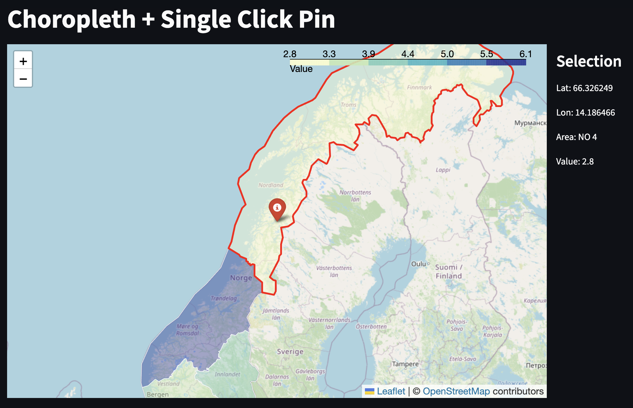
# !streamlit run "/Users/kristian/Documents/GitHub/IND320/streamlit/map_folium_choropleth.py"# Gapminder dataset as a map
import plotly.express as px
df = px.data.gapminder()
fig_chl2 = px.choropleth(df, locations="iso_alpha", color="lifeExp", hover_name="country", animation_frame="year", range_color=[20,80])
fig_chl2Notebook Cell
# Dummy cell to ensure Plotly graphics are shown
import plotly.graph_objects as go
f = go.FigureWidget([go.Scatter(x=[1,1], y=[1,1], mode='markers')])