Colours, symbols, and flags are powerful elements in dashboards and reports for guiding the user’s attention and conveying messages.
These elements are relevant both inside plots and throughout the dashboards as a whole.
Plots
Groups
Colours, linestyles and plot symbols are typically used to identify or emphasize groups or classes.
Most plotting libraries have contrasting colour series specially made for categories.
Scatterplots with group-wise symbols or symbol selection based on a DataFrame column.
# Use plotly express to plot petal widths and lengths of the iris data set (imported from plotly).
# Colour and symbol by species.
import plotly.express as px
df = px.data.iris()
fig = px.scatter(df, x="petal_width", y="petal_length", color="species", symbol="species")
fig.show()Focused element
Clicking or hovering over an element can be used to invoke a change.
Colour or size change on the selected element.
“Defocus” on the remaining elements, e.g., by changing opacity or hue.
import plotly.graph_objects as go

df = px.data.iris()
x = df["sepal_width"]
y = df["sepal_length"]

# Main plot
f = go.FigureWidget([go.Scatter(x=x, y=y, mode='markers')])
f.update_layout(xaxis_title="Sepal width", yaxis_title="Sepal length")
# Set xlimits and ylimits
f.update_yaxes(range=[4, 8.1])
f.update_xaxes(range=[1.8, 4.5])

# Create a color list based on px.colors.qualitative.Vivid, which has three colors.
colors = [px.colors.qualitative.Vivid[i] for i in df["species_id"]]
sizes = [10] * len(x)

# Attributes of the scatter object
scatter = f.data[0]
scatter.marker.color = colors
scatter.marker.size = sizes
f.layout.hovermode = 'closest'

# Create our callback function
def update_point(trace, points, selector):
    species = df["species_id"][points.point_inds[0]]
    # Change all ellements in cols that have df.species != species gray
    # to '#bae2be'. Keep in mind that df.species is a series and that cols is a list.
    cols = ['#BBBBBB' if s != species else px.colors.qualitative.Vivid[s] for s in df.species_id]
    size = [14 if s == species else 10 for s in df.species_id]

    with f.batch_update():
        scatter.marker.color = cols
        scatter.marker.size = size

def reset_point(trace, points, selector):
    with f.batch_update():
        scatter.marker.color = colors
        scatter.marker.size = sizes

# Assign the callback function to the scatter object
scatter.on_hover(update_point)
scatter.on_unhover(reset_point)

f # Do not use .show() or the figure will not be interactiveOutliers/alerts
The same basic techniques can be used as with focused elements, but the message should be stronger.
Where a focused element may obtain a more intense colour or grow slightly, a proper contrast colour, typically bright red, is needed for outliers that warrant an alert.
For outliers that are seen as part of the background noise, the symbolics should not be as strong.
df = px.data.iris()
fig = px.scatter(df, x="sepal_width", y="sepal_length", color="species")

# Add a red cross behind the samples with lowest and highets sepal width
df_extreme = df[(df.sepal_width == df.sepal_width.min()) | (df.sepal_width == df.sepal_width.max())]
fig.add_trace(go.Scatter(x=df_extreme.sepal_width, y=df_extreme.sepal_length, mode="markers",
                         marker=dict(color="black", size=12, symbol="cross"), showlegend=False))
fig.add_trace(go.Scatter(x=df_extreme.sepal_width, y=df_extreme.sepal_length,
                         mode="markers", marker=dict(color="red", size=12, symbol="cross-open"),
                         showlegend=False))

# Traces are plotted in the order they are added. To plot the crosses behind the original data,
# we need to change the order of the traces.
fig.data = (fig.data[3], fig.data[4], fig.data[0], fig.data[1], fig.data[2])

# Add title and axis labels
fig.update_layout(title="Can you spot the outliers?",
                  xaxis_title="Sepal width", yaxis_title="Sepal length")
fig.show()# Plot a random sample of 1000 normal distributed points as a 2D scatter plot.
import numpy as np
np.random.seed(1)
N = 1000
random_x = np.random.randn(N)
random_y = np.random.randn(N)
dist_origin = np.sqrt(random_x ** 2 + random_y ** 2)
# Let the colour be blue and the opacity 0.7 for points closer than 2 from the origin.
# Use opacity = 0.2 for all other points.
fig = px.scatter(x=random_x[dist_origin > 2], y=random_y[dist_origin > 2], opacity=0.2, color_discrete_sequence=['blue'])
fig.add_trace(go.Scatter(x=random_x[dist_origin <= 2], y=random_y[dist_origin <= 2],
mode="markers", marker=dict(color="blue", opacity=0.7), showlegend=False))
# Add a circle with radius 2 around the origin
fig.add_shape(type="circle", xref="x", yref="y", x0=-2, y0=-2, x1=2, y1=2, line_color="LightSeaGreen")
fig.update_layout(title="Softening outliers using opacity")
fig.show()Colour blindness
Colour blindness affects up to 8% of men and 0.5% of women.
Red-green is the most common problem, followed by blue-yellow, but there are many variants.
Each version comes with several confusions, e.g., red-green colourblindness may cause problems in distingushing:
cyan and grey,
rose-pink and grey,
blue and purple,
yellow and neon green,
red, green, orange, brown.
Some sequential colourmaps are designed to convey the differences regardless of vision type by superimposing a light-to-dark scale and yellow-to-blue scale, e.g., Cividis, Viridis, and Parula.
A simplified depiction of colour perception for various conditions (public domain figure from Wikimedia Commons)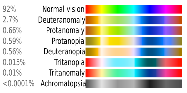
# Use plotly express to plot petal widths and lengths of the iris data set (imported from plotly).
# Colour by species.
# Use a colour scale friendly to colour blind people.
import plotly.express as px
df = px.data.iris()
fig = px.scatter(df, x="petal_width", y="petal_length", color="species",
                 color_discrete_sequence=px.colors.qualitative.Vivid)
fig.show()Colour perception
Colour perception is not linear with RGB values.
Thus, resolving colours of different intensities is not equal for all colours.
Some colour gradients are specially made to appear linear.
matplotlib colormaps has a comprehensive overview of colour choices.
# Add ipywidgets slider to control the number of rectangles.
import matplotlib.pyplot as plt
import matplotlib.patches as patches
import ipywidgets as widgets
def plot_rectangles(n):
    # Set figure size to 10 x 4
    _, ax = plt.subplots(figsize=(10, 4))
    for i in range(n):
        rectR = patches.Rectangle((i / n, 5), 1 / n, 1, facecolor=(i / (n-1), 0, 0))
        ax.add_patch(rectR)
        rectG = patches.Rectangle((i / n, 4), 1 / n, 1, facecolor=(0, i / (n-1), 0))
        ax.add_patch(rectG)
        rectB = patches.Rectangle((i / n, 3), 1 / n, 1, facecolor=(0, 0, i / (n-1)))
        ax.add_patch(rectB)
        rectY = patches.Rectangle((i / n, 2), 1 / n, 1, facecolor=(i / (n-1), i / (n-1), 0))
        ax.add_patch(rectY)
        rectC = patches.Rectangle((i / n, 1), 1 / n, 1, facecolor=(0, i / (n-1), i / (n-1)))
        ax.add_patch(rectC)
        rectM = patches.Rectangle((i / n, 0), 1 / n, 1, facecolor=(i / (n-1), 0, i / (n-1)))
        ax.add_patch(rectM)
    # Set y limits
    ax.set_ylim(0, 6)
    plt.show()
widgets.interact(plot_rectangles, n=widgets.IntSlider(min=20, max=100, step=1, value=20))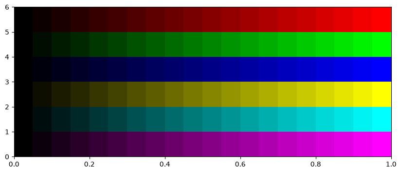
<function __main__.plot_rectangles(n)># There are many colourmaps in matplotlib.
from matplotlib import colormaps
list(colormaps)['magma',
'inferno',
'plasma',
'viridis',
'cividis',
'twilight',
'twilight_shifted',
'turbo',
'berlin',
'managua',
'vanimo',
'Blues',
'BrBG',
'BuGn',
'BuPu',
'CMRmap',
'GnBu',
'Greens',
'Greys',
'OrRd',
'Oranges',
'PRGn',
'PiYG',
'PuBu',
'PuBuGn',
'PuOr',
'PuRd',
'Purples',
'RdBu',
'RdGy',
'RdPu',
'RdYlBu',
'RdYlGn',
'Reds',
'Spectral',
'Wistia',
'YlGn',
'YlGnBu',
'YlOrBr',
'YlOrRd',
'afmhot',
'autumn',
'binary',
'bone',
'brg',
'bwr',
'cool',
'coolwarm',
'copper',
'cubehelix',
'flag',
'gist_earth',
'gist_gray',
'gist_heat',
'gist_ncar',
'gist_rainbow',
'gist_stern',
'gist_yarg',
'gnuplot',
'gnuplot2',
'gray',
'hot',
'hsv',
'jet',
'nipy_spectral',
'ocean',
'pink',
'prism',
'rainbow',
'seismic',
'spring',
'summer',
'terrain',
'winter',
'Accent',
'okabe_ito',
'Dark2',
'Paired',
'Pastel1',
'Pastel2',
'Set1',
'Set2',
'Set3',
'tab10',
'tab20',
'tab20b',
'tab20c',
'grey',
'gist_grey',
'gist_yerg',
'Grays',
'magma_r',
'inferno_r',
'plasma_r',
'viridis_r',
'cividis_r',
'twilight_r',
'twilight_shifted_r',
'turbo_r',
'berlin_r',
'managua_r',
'vanimo_r',
'Blues_r',
'BrBG_r',
'BuGn_r',
'BuPu_r',
'CMRmap_r',
'GnBu_r',
'Greens_r',
'Greys_r',
'OrRd_r',
'Oranges_r',
'PRGn_r',
'PiYG_r',
'PuBu_r',
'PuBuGn_r',
'PuOr_r',
'PuRd_r',
'Purples_r',
'RdBu_r',
'RdGy_r',
'RdPu_r',
'RdYlBu_r',
'RdYlGn_r',
'Reds_r',
'Spectral_r',
'Wistia_r',
'YlGn_r',
'YlGnBu_r',
'YlOrBr_r',
'YlOrRd_r',
'afmhot_r',
'autumn_r',
'binary_r',
'bone_r',
'brg_r',
'bwr_r',
'cool_r',
'coolwarm_r',
'copper_r',
'cubehelix_r',
'flag_r',
'gist_earth_r',
'gist_gray_r',
'gist_heat_r',
'gist_ncar_r',
'gist_rainbow_r',
'gist_stern_r',
'gist_yarg_r',
'gnuplot_r',
'gnuplot2_r',
'gray_r',
'hot_r',
'hsv_r',
'jet_r',
'nipy_spectral_r',
'ocean_r',
'pink_r',
'prism_r',
'rainbow_r',
'seismic_r',
'spring_r',
'summer_r',
'terrain_r',
'winter_r',
'Accent_r',
'okabe_ito_r',
'Dark2_r',
'Paired_r',
'Pastel1_r',
'Pastel2_r',
'Set1_r',
'Set2_r',
'Set3_r',
'tab10_r',
'tab20_r',
'tab20b_r',
'tab20c_r',
'grey_r',
'gist_grey_r',
'gist_yerg_r',
'Grays_r']Dashboards and reports
Colours
Colours and symbols are also useful outside plots.
Visual cues:
Grouping elements with separate background colour or border.
Making some plot stand out from the crowd by using a contrast around it.
Changing background, text colour, or text background colour based on user actions or events in the data.
Colour themes can be complimentary to plots or crash harshly. Both are effects that are useful.
A colour-picker is useful for syncing colours or finding different versions.
Changing between HEX (#000000), RGB (0,0,0), and HSL (0,0,0) can be used when exploring colours:
For instance, choose a colour using a colour picker (e.g., PowerPoint), switch to HSL and cycle through hues.
This results in limiting a colour search to colours with matching saturation (colour intensity from gray to pure) and lightness (from black to full colour/white).
Color wheels are also useful tools for selecting matching colours.
Colours for KPIs (key performance indicators) emphasise ranges, e.g., positive vs negative, within the normal vs extreme, etc.
Colours for alerts are powerful, not only in symbols/signs, but also for backgrounds.
Symbols
Emojis, cliparts, animated GIFs and similar are effective in catching attention.
Therefore they must be used sparingly.
A spinning company logo might be cool at first sight, but quickly becomes anoying.
Static, graphical elements that blend in to the theme may be used as long as they have a function, e.g., conveying identity, showing a state, or making it easy to detect which app/environment is active.
Symbols used as alerts must be immediately visible using sharp contrasts.
In Streamlit, an alert sign can be dynamically loaded when needed.
Exercise
Test the use of colors and conditional symbols/flags in Streamlit.